Blueboard Accessibility Rebrand + Web Redesign
Blueboard Accessibility Rebrand + Web Redesign
THE GIST
THE GIST
In December 2022, I led the experiential overhaul of Blueboard's website, with a focus on creating a web experience just as impactful as a Blueboard experience. This was a new deep dive into Webflow animations and interactions, while building new coding skills with an emphasis on animation scripts.
Previous in March 2022, Blueboard launched a new web experience that brought a brand refresh focused on accessibility and highlighting the recipient experience. As Senior Designer, I led the creation of new brand guidelines, developed high-fidelity mockups and prototypes of the website for the Design team, managed ongoing analytics monitoring and reporting, and completed the build with Webflow.
THE IMPACT
THE IMPACT
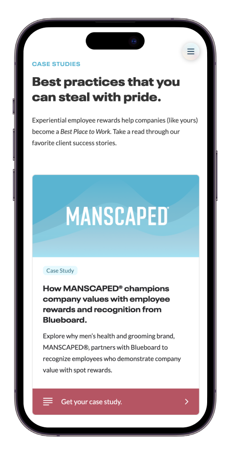
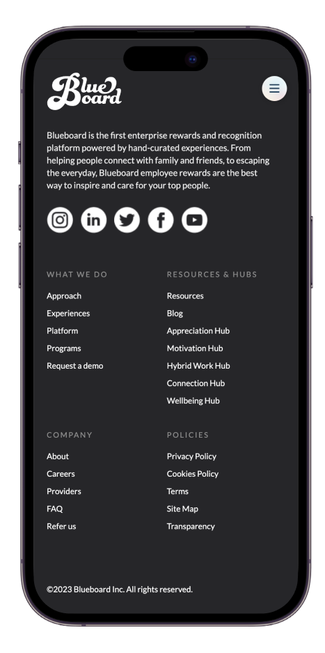
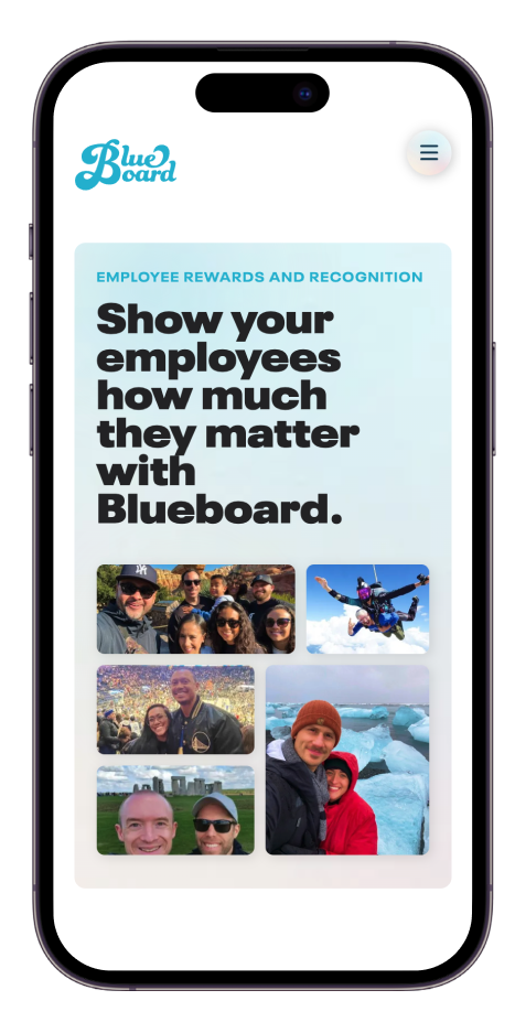
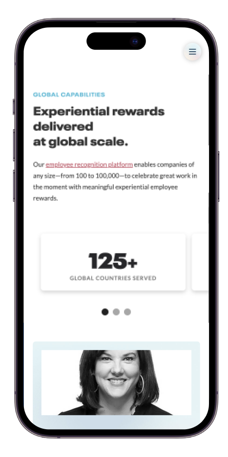
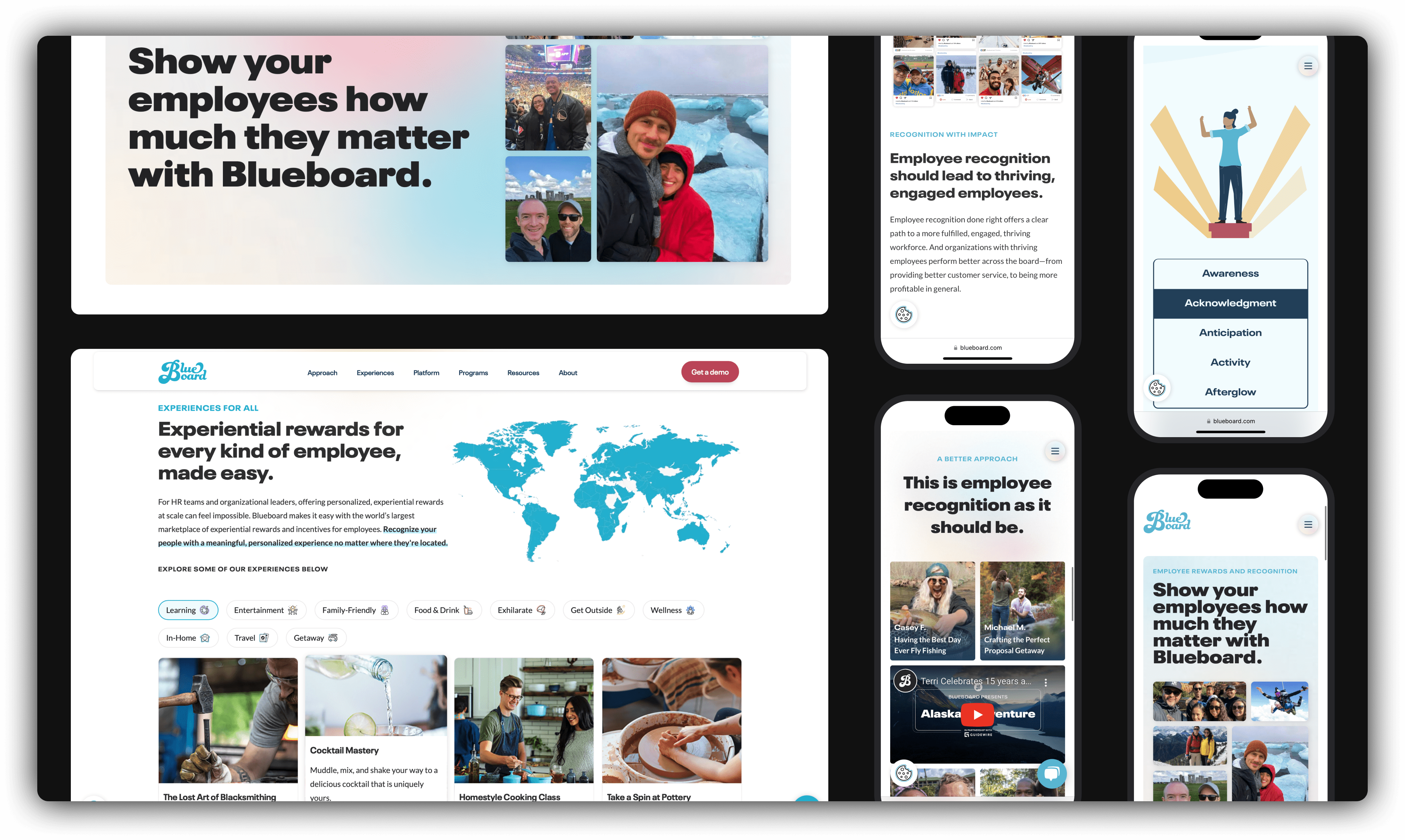
Launching in January 2023, the new approach on Blueboard.com provides users with a clear journey through Blueboard's mission and impact. Leading with a mobile first approach, we strived to make the experiences just as smile-inducing on your phone as on the big screen.
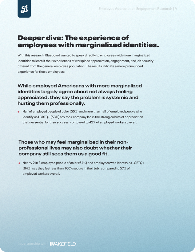
Transforming over 50 pages, Blueboard saw overall site speed and performance increases and achieved full WCAG compliance. A 70% increase in Blueboard recipient-submitted photos is proudly showcased throughout hero and body images, and the team saw increases in time on page while seeing a slight decrease in bounce rate. All of these updates we're paired with comprehensive company-wide training on the new brand guidelines and usage.
THE TOOLS
THE IMPACT
Figma, Webflow, Adobe CC, Hubspot, Google Analytics, WCAG Compliance
THE RESEARCH
PRESIDENT'S CLUB PRODUCT BRANDING
- Built an understanding of WCAG Accessibility Guidelines, their implications, and where to start.
- Explored alternative color schemes and tested their impact on previously inaccessible elements.
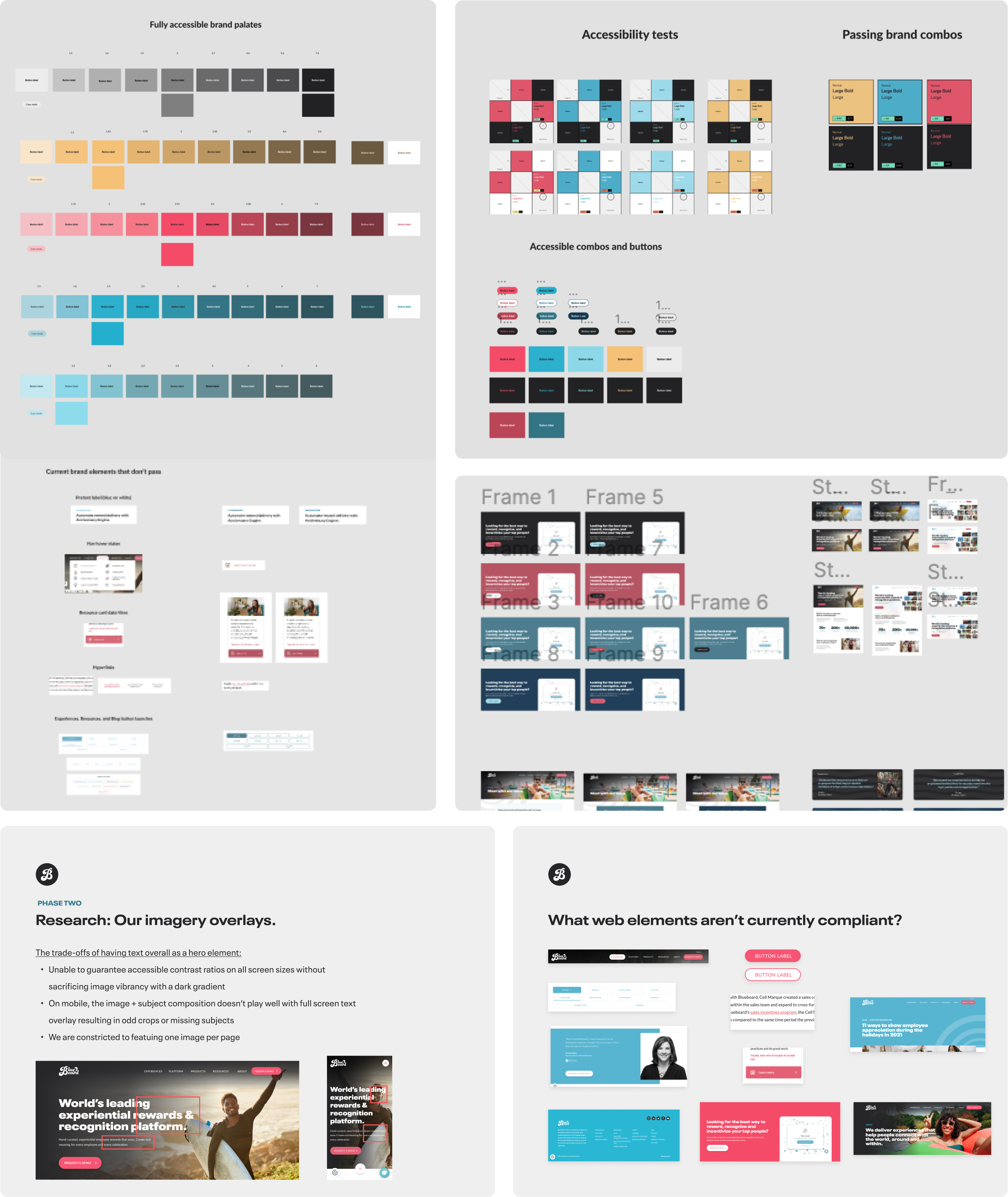
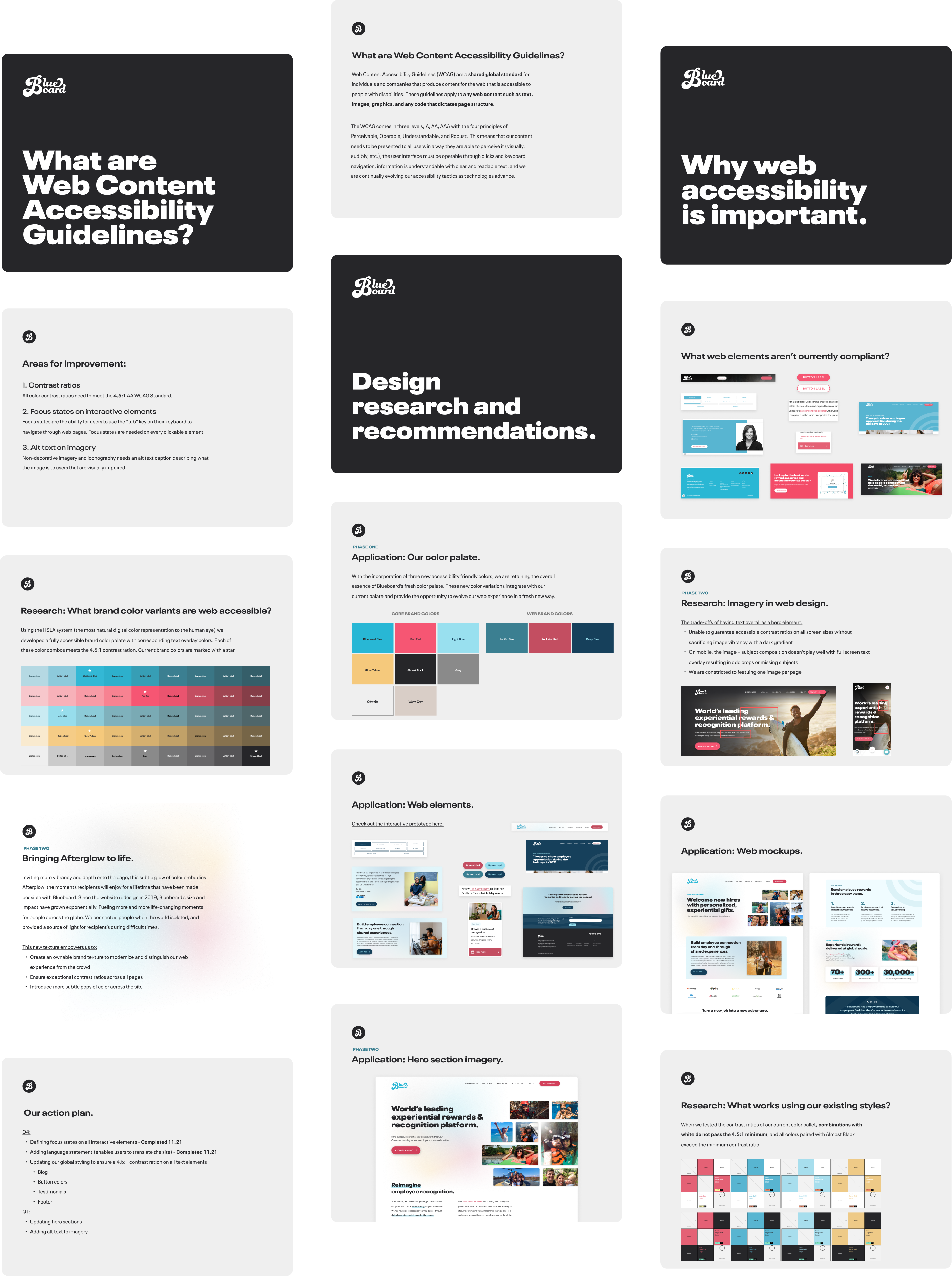
- Audited the previous web design system to identify non-compliant elements, global areas of opportunity, and determined an actionable plan of action.
THE PITCH
PRESIDENT'S CLUB PRODUCT BRANDING
- Delivered a pitch to the Founders and Sr. Director of Marketing for approval to relaunch the Brand Guidelines and redesign the website.
- Introduced new colors, textures, digital design system, and a slew of accessibility optimizations.
- Left the Founders with an interactive website prototype to get a feel for the new design system (and a due date for feedback).
THE BUILD
PRESIDENT'S CLUB PRODUCT BRANDING
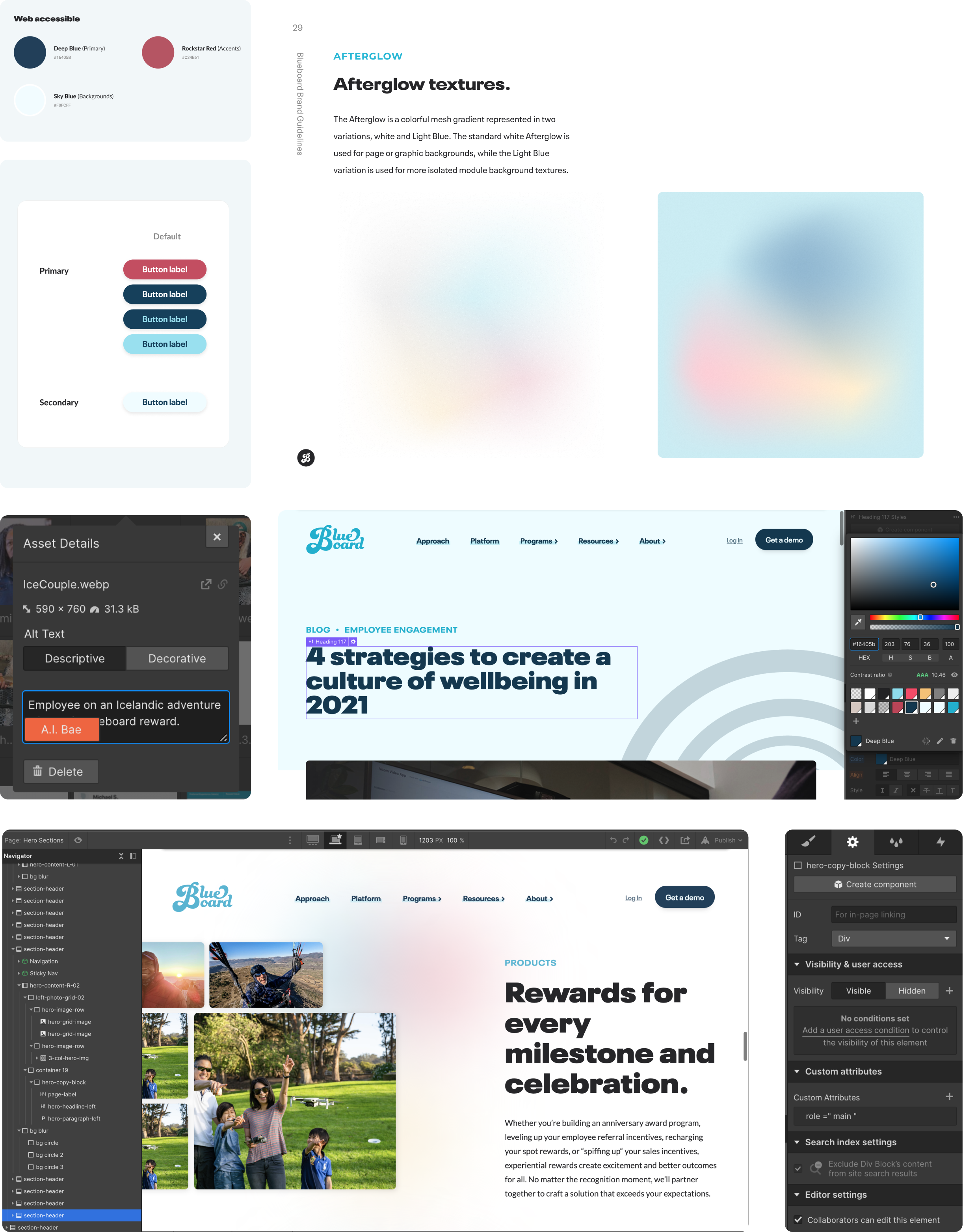
- Created fresh brand guidelines with focus around accessibility considerations, more detailed guidelines for design element applications, and the introduction of new colors, textures, and best practices.
- Built off of the Figma prototype to develop the new website experience including focus states, image alt-text, and lots of accessibility attributes.
- Learned new capabilities and techniques to enable a more engaging user experience.
BRINGING THE RECIPIENT EXPERIENCE TO LIFE
PRESIDENT'S CLUB PRODUCT BRANDING
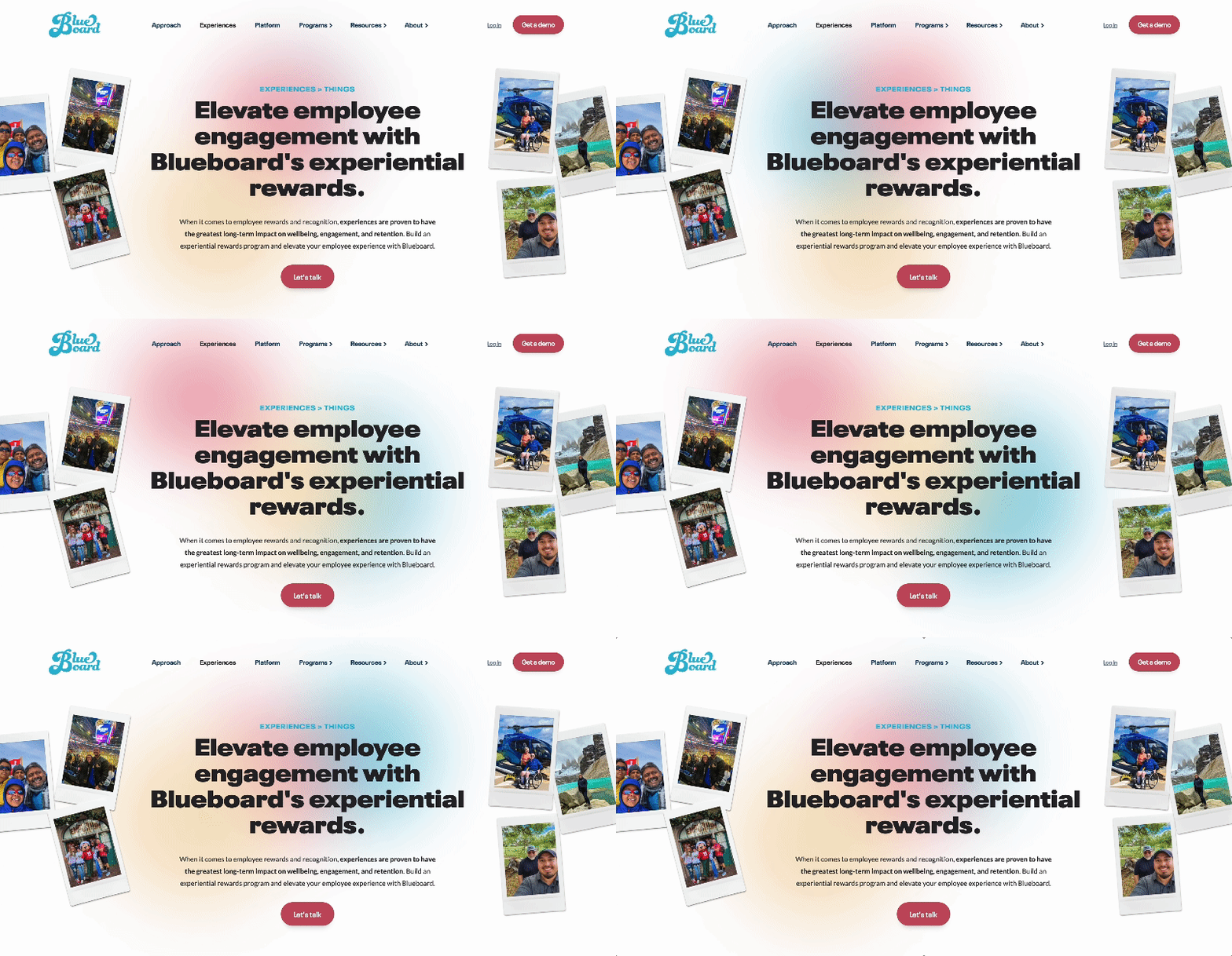
One of the new brand elements introduced in 2022 was the Afterglow texture. Glowing in the hero of each page, a subtle animated glow of the brand colors brings to life the concept of Afterglow, which Blueboard tags as those warm and fuzzy feelings you have looking back on an epic adventure.
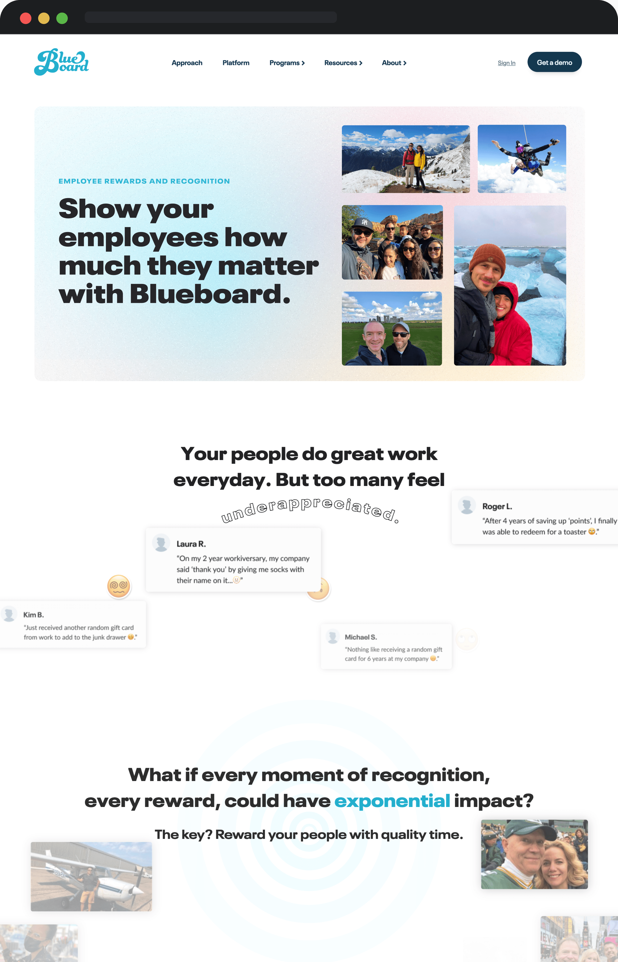
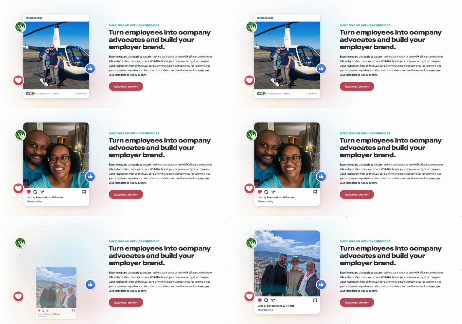
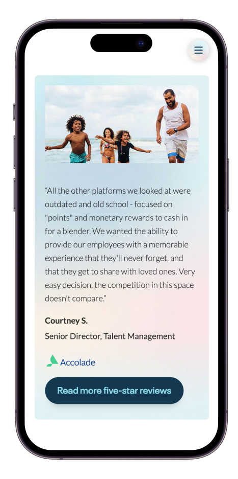
Another way we brought the recipient experience to the forefront was by reimagining the hero sections to include up to nine recipient-submitted images on each page. Not only did this change increase the number of recipient images on the site by 70%, but it also ensured text remained accessible on all screen sizes.
Check it out live at Blueboard.com.
MOTION AND MAGIC
THE PRESIDENT'S CLUB HUB
MOTION AND MAGIC
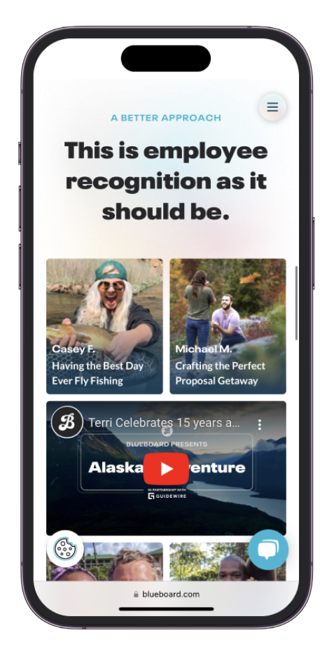
In efforts to create an immersive Home page experience, I dove into the world of Webflow custom JavaScript and interaction animations. This scrollable journey brings users through the experience of Blueboard as they move down the page, with elements of suprise and delight along the way.
BRING ON THE VIDEO
THE PRESIDENT'S CLUB HUB
BRING ON THE VIDEO
With a rockstar Videographer on the team pumping out killer video content, we wanted to bring it to life through the site with Platform GIFs, recipient interviews, a marketing hype reels to keep users engaged and educated.
FRESH GUIDELINES
THE GIST
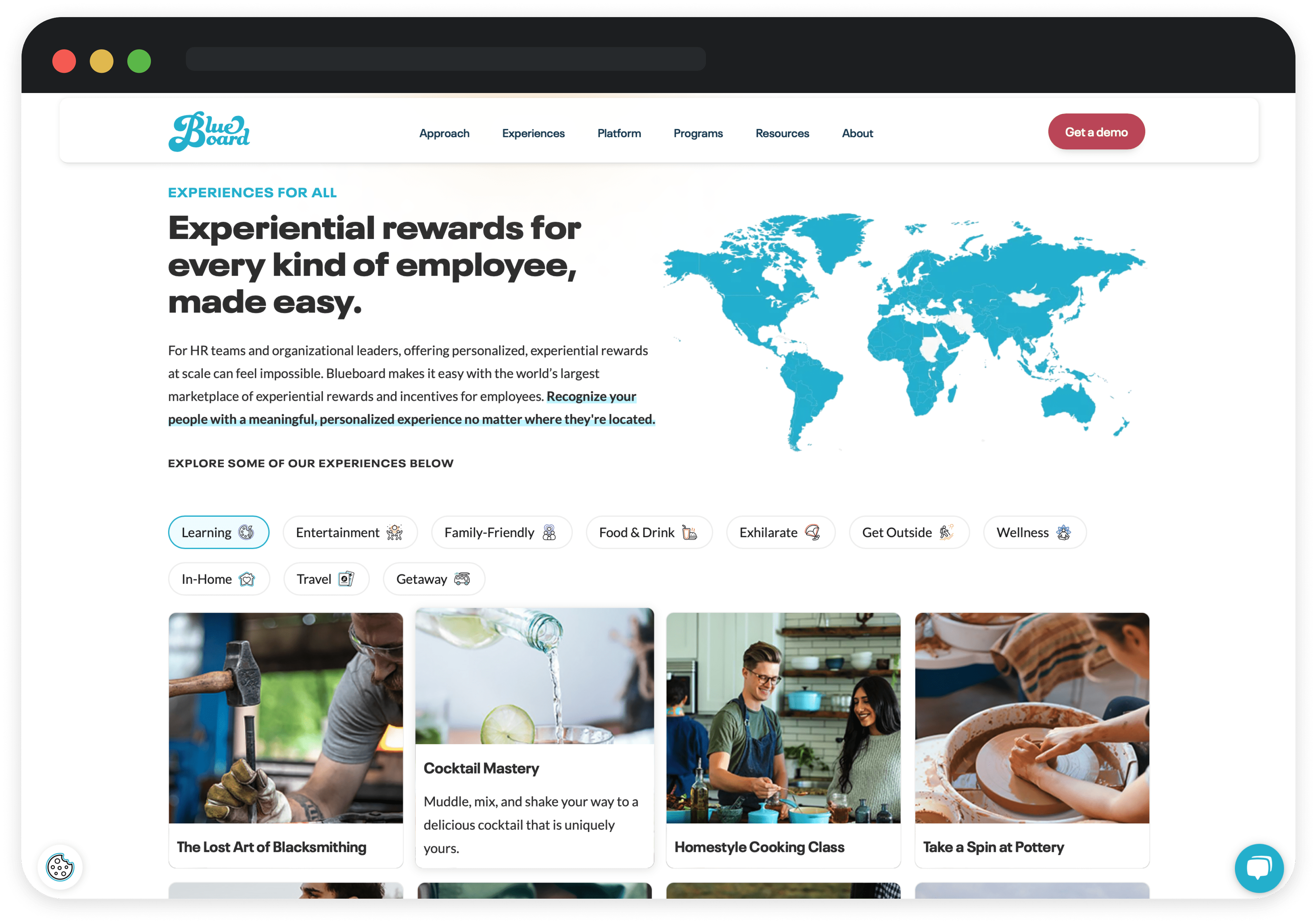
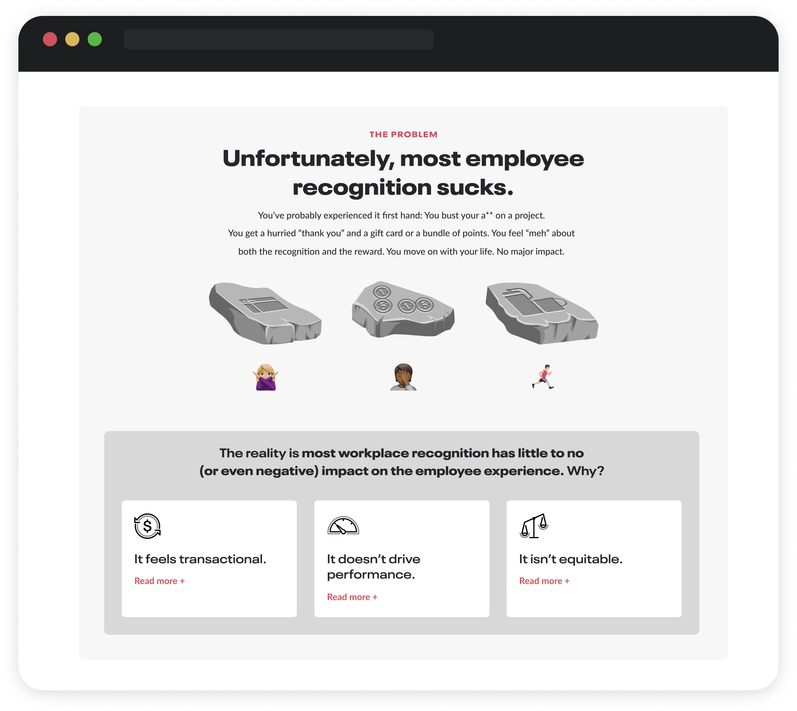
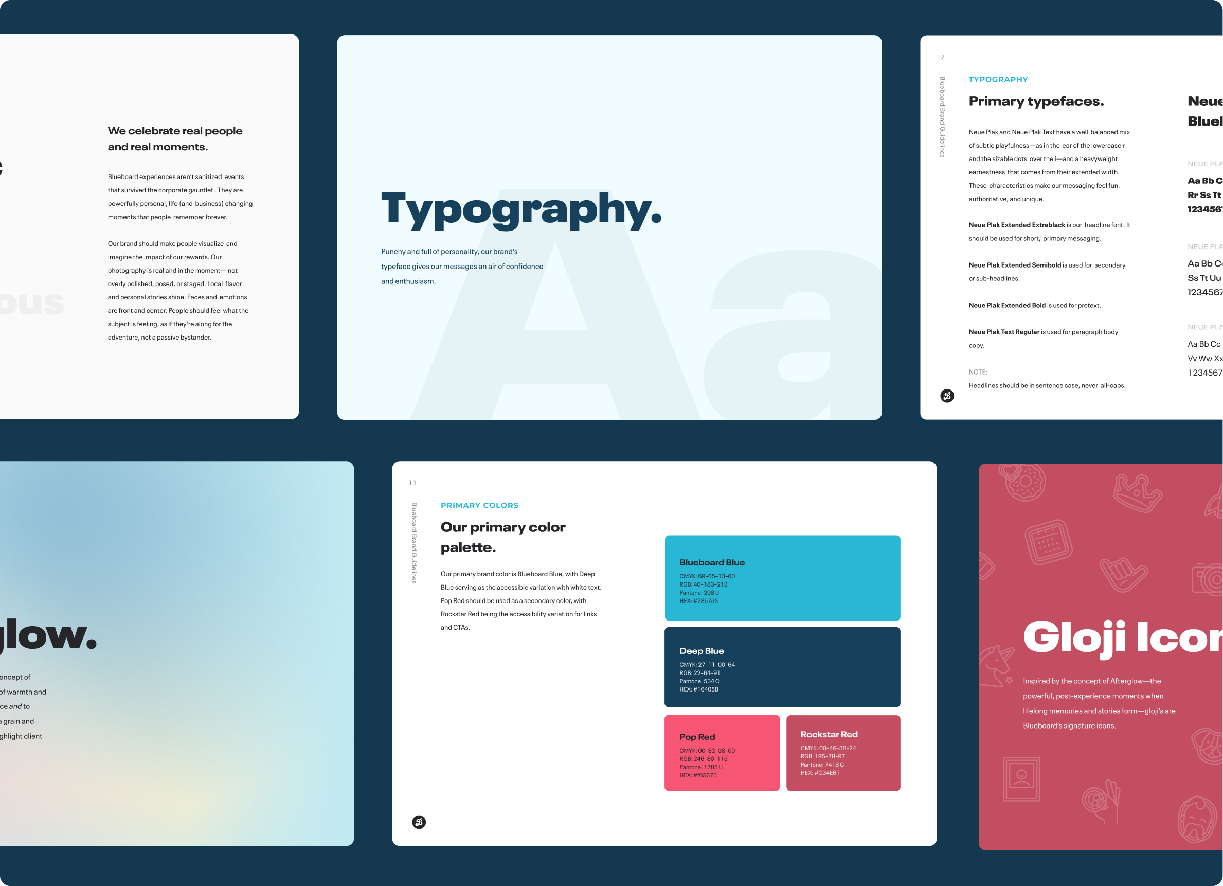
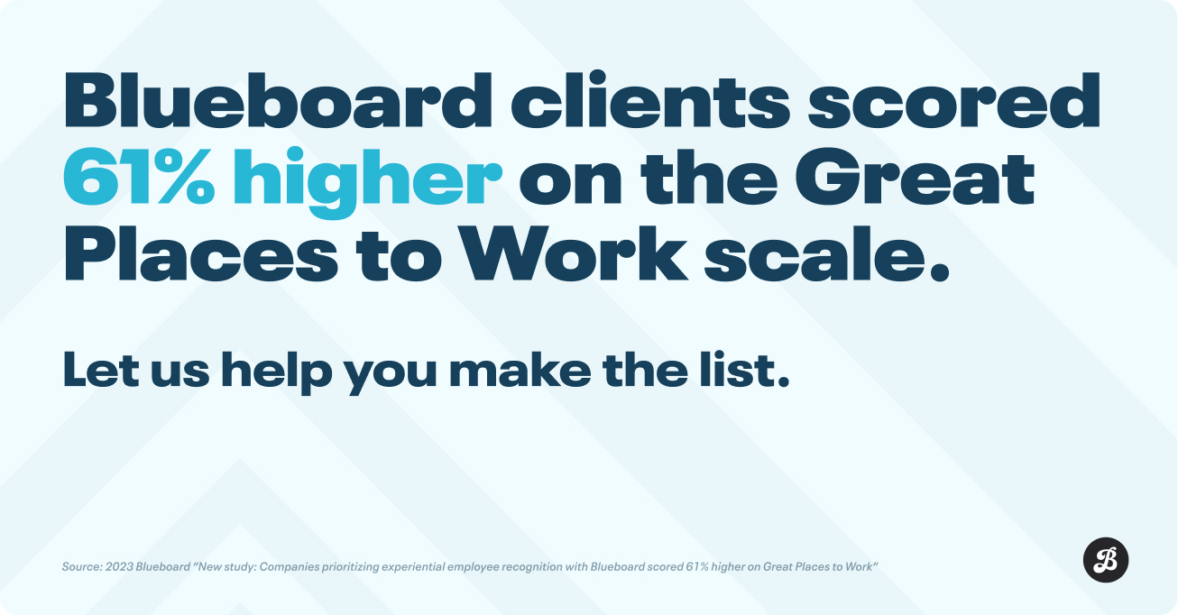
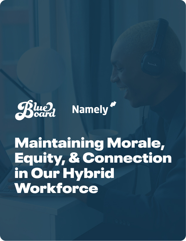
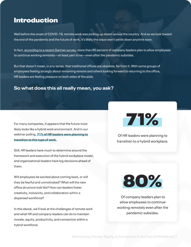
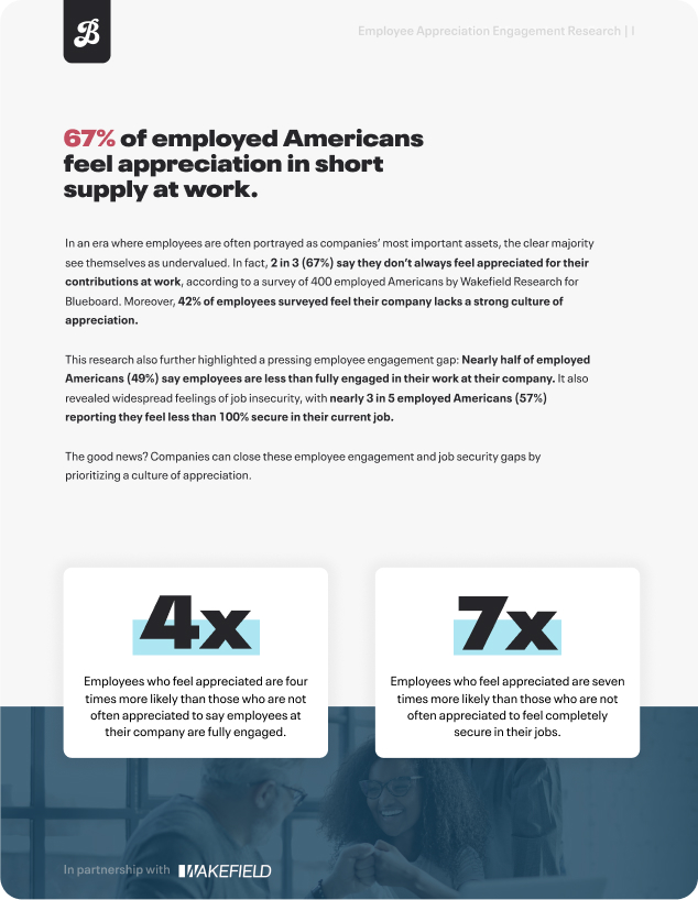
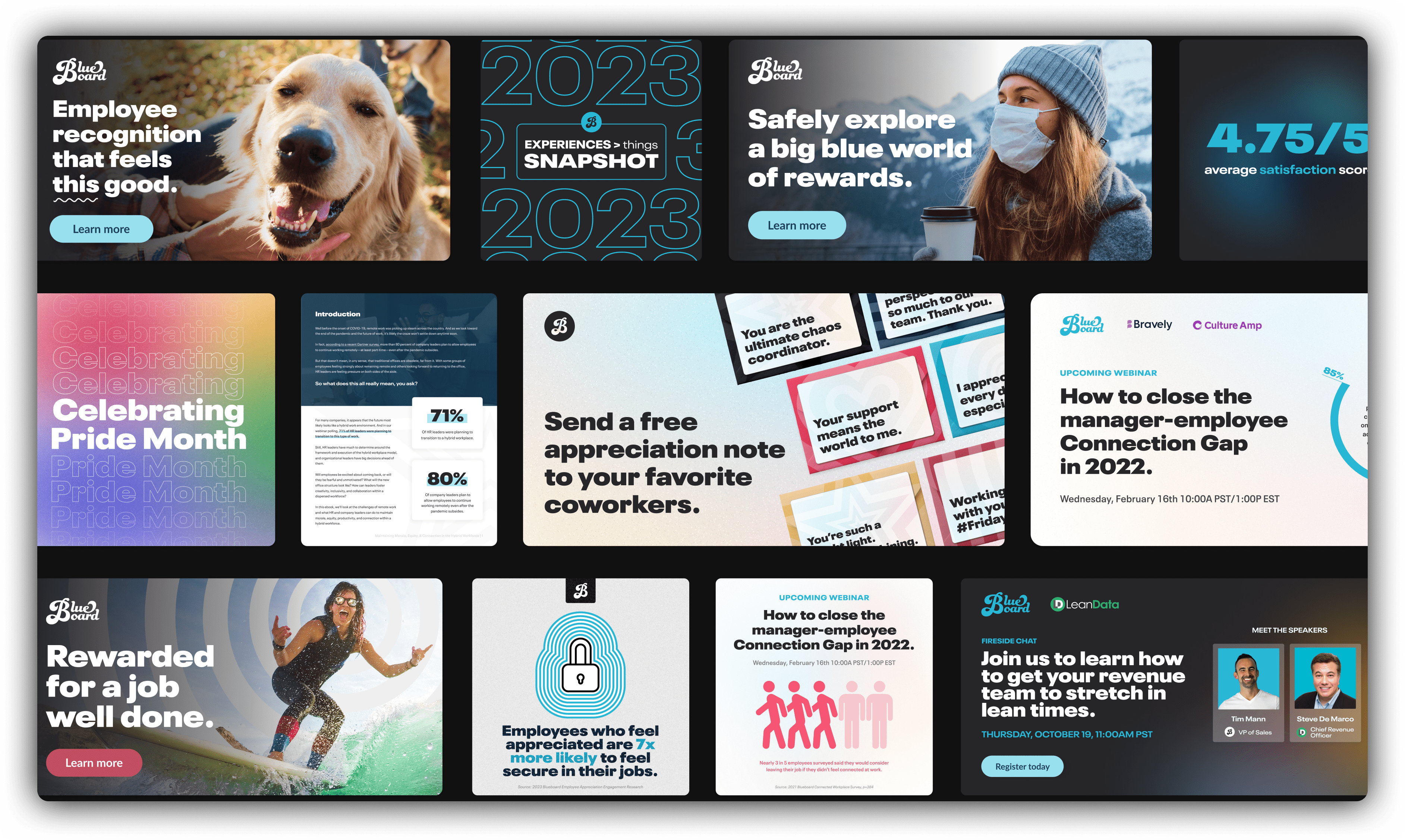
Alongside the new web experience, we launched a fresh edition of the Brand Guidelines including new brand elements and more actionable guides to maintain accessibility standards across all branded collateral.
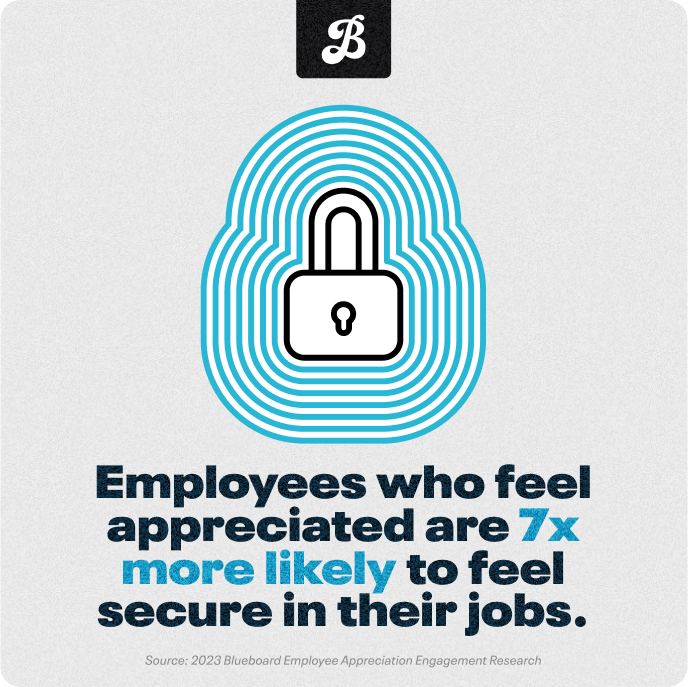
Below are a few other ways we brought the new guidelines to life through digital ads, social media, eBooks, original research, and more.


Other projects
Print, ads, and everything elseProject type

FilmPhotography
Blueboard.com WebsiteBranding | Web design | Paid media | Videography
Aidaly RebrandBranding | Web design

Blueboard Client Resource HubProduct design | Web design
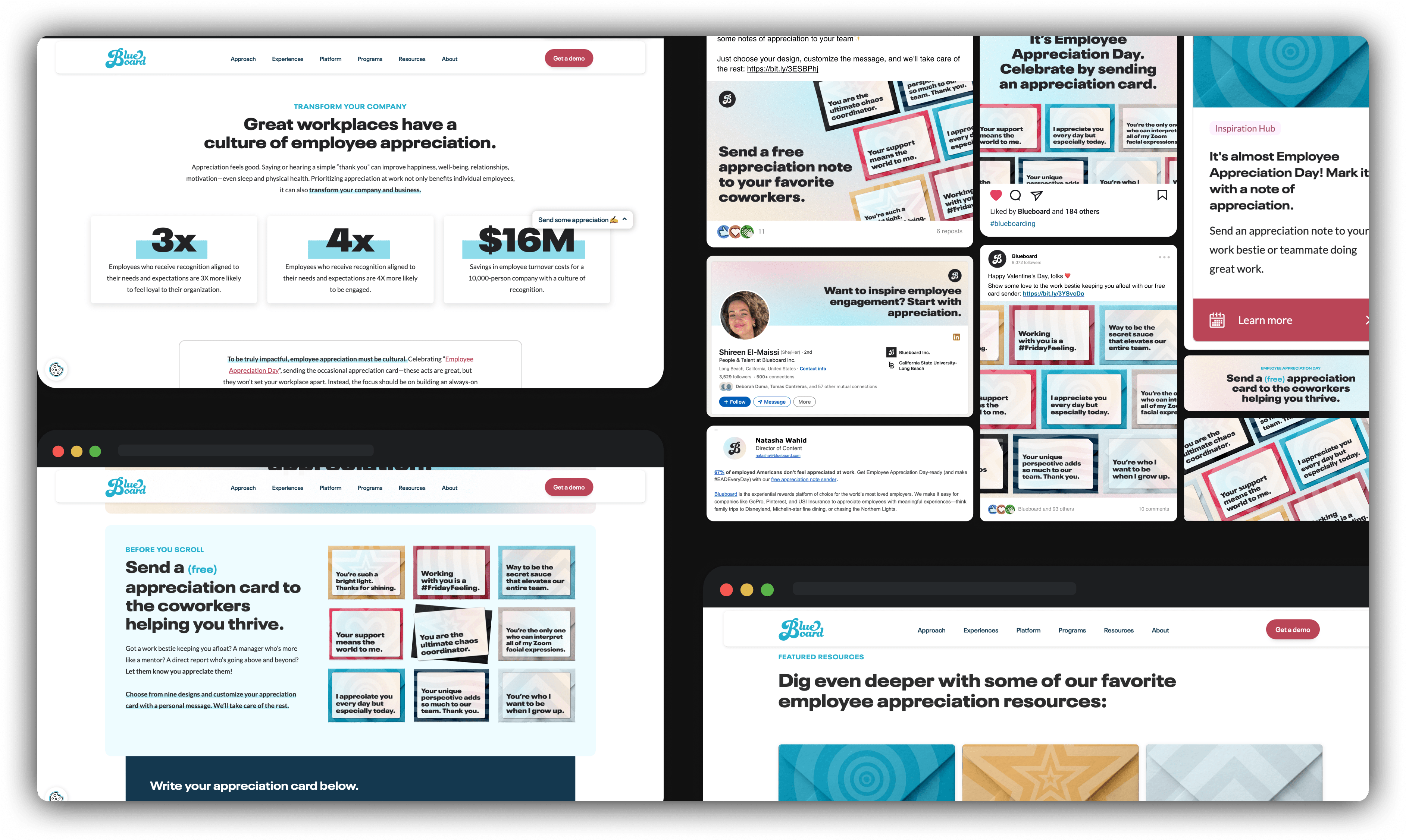
Blueboard Employee Appreciation HubProduct design | Web design
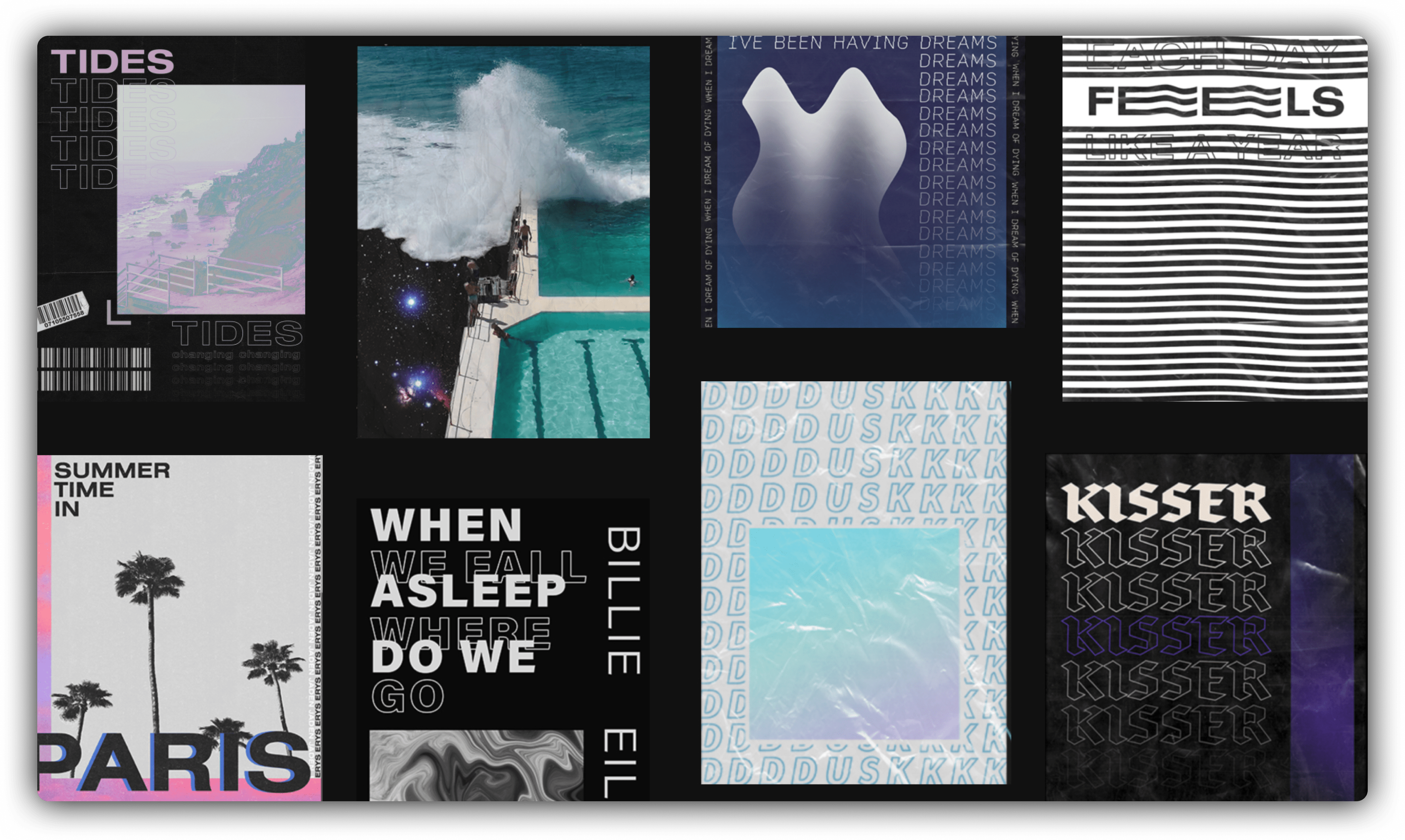
Poster SeriesGraphic design
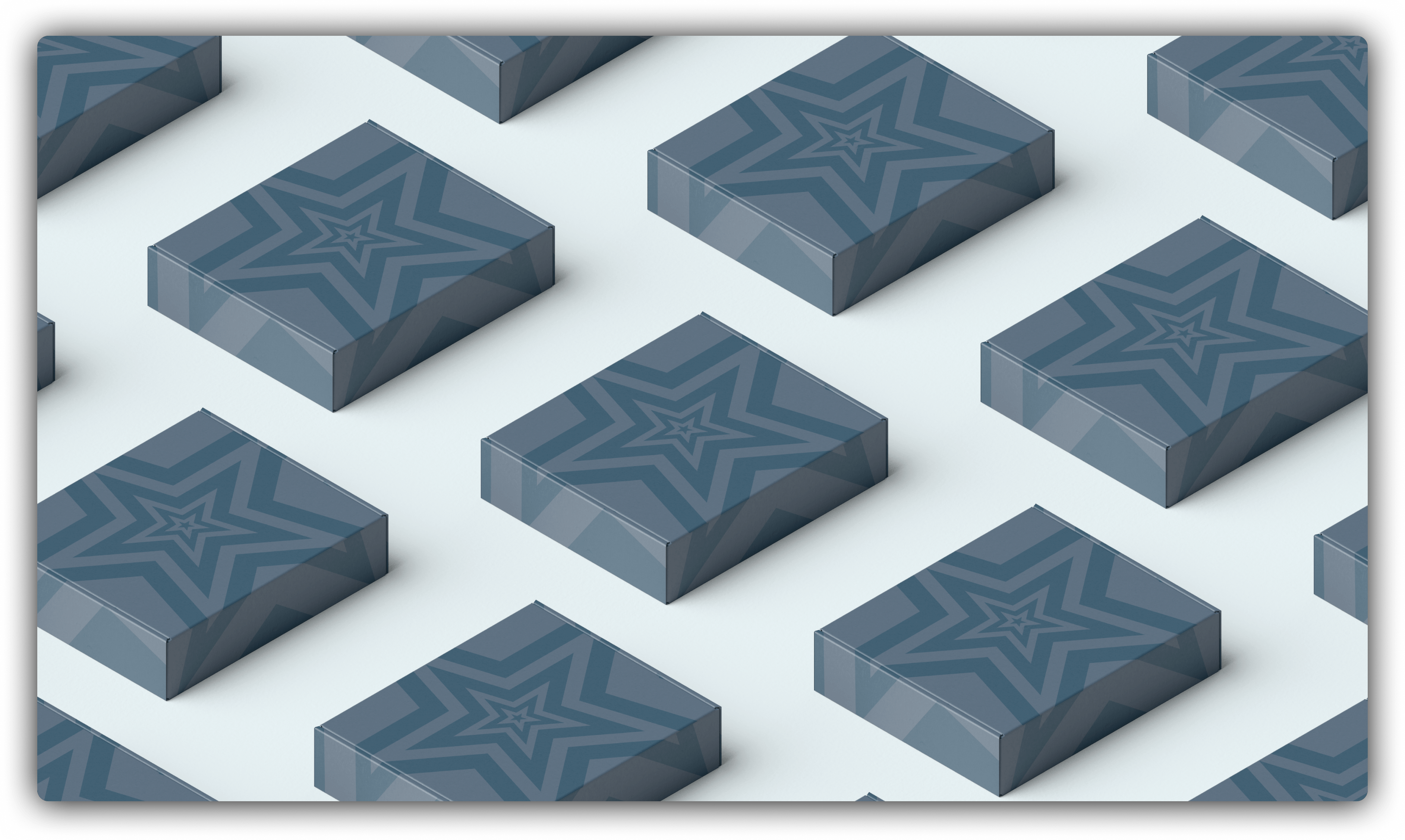
Blueboard Office Design, Swag, & PackagingApparel design | Interior design
Cisco Systems Disti LocatorWeb design
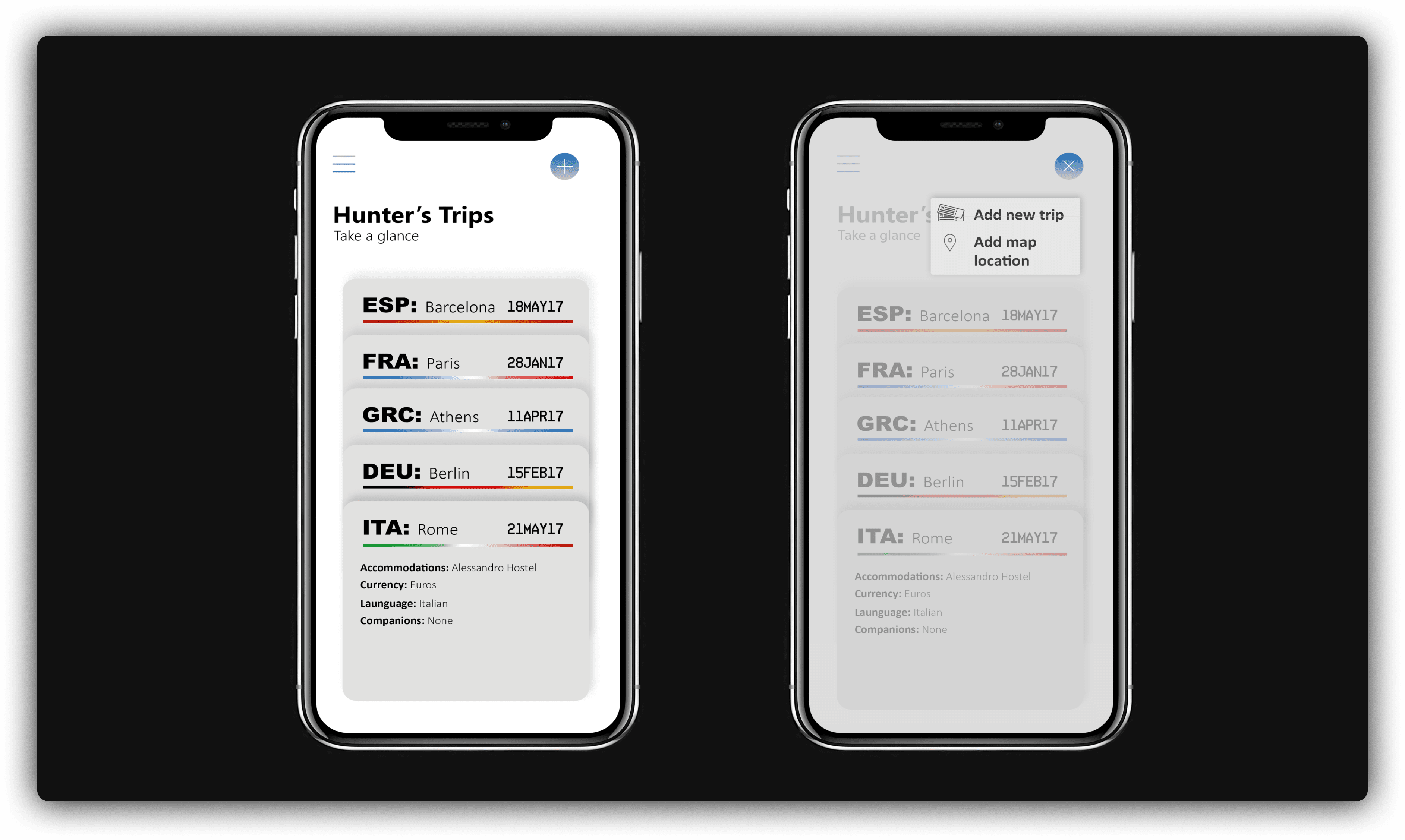
Trip journalUX design
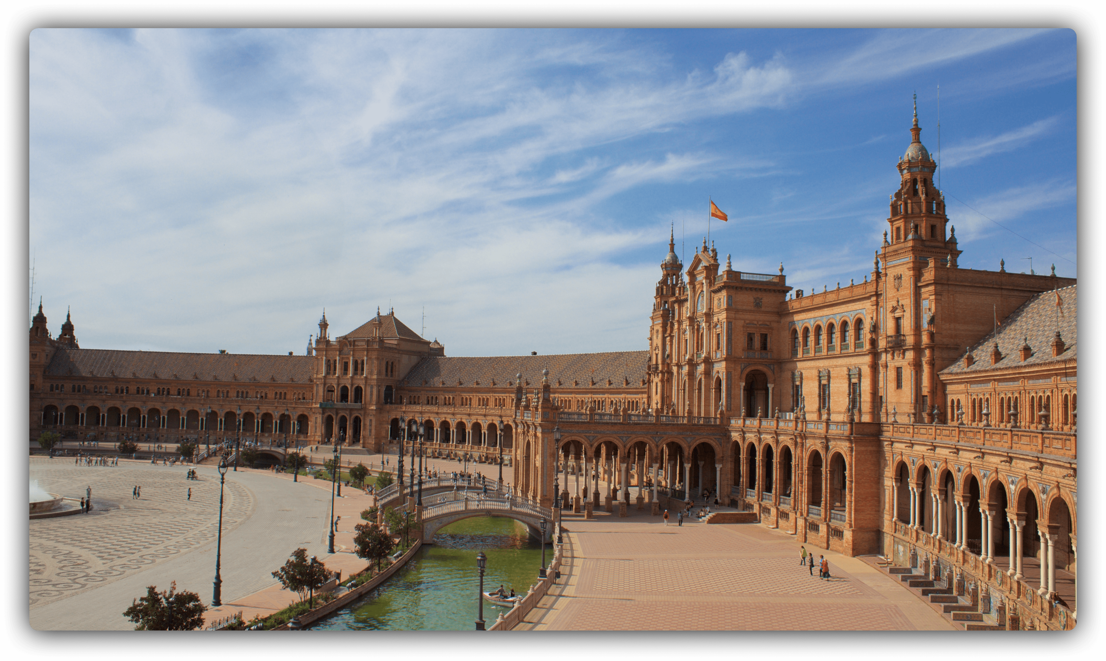
Running Around The WorldPhotography
Copyright 2024 © Hunter McLean

